


Update Solarium
Zimo
4 min read · Oct 26, 2025
Tags of this article:
Update Solarium
Over a year ago, Zimo Web introduced the Vitreous theme. The word vitreous means “resembling glass in appearance,” and the theme embodied that concept quite well. Update Solarium builds upon the ideas of glass and light, bringing a delightful redesign to Zimo Web.
Over time, trends in web design and user interface aesthetics have changed drastically. Today, many favor a minimalist, glass-like aesthetic. Zimo Web once embraced a more crude and utilitarian style. Though it incorporated elements of modern design, their implementation felt somewhat barbaric. Update Solarium reimagines the core components of Zimo Web, such as the navigation bar and side menu, through the lens of a modern design system that emphasizes adaptivity and hierarchy. Combined with a glass-inspired aesthetic, the result is a refreshing yet familiar look for the two-year-old website.
The idea of a systemic redesign was first proposed early this year. Shortly after Update Ouroboros shipped, I began thinking about the next step for Zimo Web. Functionally, there wasn’t much left to add, as the windowing system felt like the culmination of the site’s gizmos. Soon after, the Forms Update was released, which partially explored the idea of a redesign but ultimately focused only on iconography and consistency. The broader redesign idea therefore remained on the table for months.
In the meantime, I turned my attention to addressing the technical debt that had accumulated over the year. I once viewed Zimo Web as a project I could be truly proud of: clean, elegant, and well-organized internally. Countless updates had disrupted that balance. I began drafting a list of tasks to pay off this technical debt and refactor key infrastructure. The list grew enormous, and my repeated attempts to tackle it failed. That is, until recently, when I started experimenting with derivative projects of Zimo Web. With some meaningful progress finally made, I decided to merge my previous experiments and improvements into a single major update for the main site. Coinciding with Zimo Web’s two-year anniversary, this became Update Solarium, a balanced evolution combining a visual overhaul with consistency in the underlying architecture.
New Design
The core design principles of Update Solarium are concentricity, translucency, and specular highlighting. The numerous rounded corners from the previous design have been carefully refined so that outer corners are more rounded and concentric with the inner ones, creating a harmonious, joyful visual rhythm. The blurring effects have been reworked to produce a more vivid, glass-like translucency. Specular highlights are now applied to smaller elements such as buttons using a mix of gradients and masking, which looks particularly striking in darker themes. This required upgrading Zimo Web’s theme engine to calculate brighter tones of theme colors while preserving their hue.
Because specular highlights can be performance-heavy and less effective on larger elements, a subtle outline is used to achieve a similar effect. Shadows have also been tuned to be softer and less directional, adding to the cohesive, elegant look.
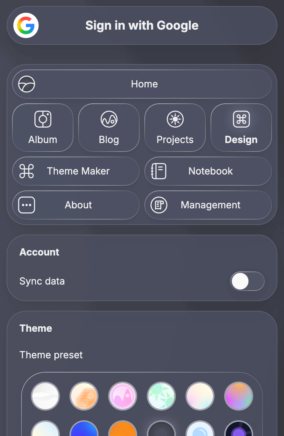
The new side menu.
The side menu has been completely redesigned. Instead of sliding in abruptly from the side or top, it now fades in gracefully with a seamless scroll-edge effect and progressive blur. Elements within the menu have been adjusted to fit more compactly and neatly within the layout. The navigation panel has also been reworked to emphasize concentricity and specular highlights. Together, they create a visually satisfying and cohesive experience.

The redesigned navigation bar.
The navigation bar has also been completely rethought. Instead of spanning the entire horizontal space, it now separates navigation and utility functions across opposite sides of the screen. Visual clutter has been reduced, and a clean specular highlight adds subtle depth. The new navigation bar adapts fluidly to different interactions – such as scrolling or opening the side menu – gracefully adjusting its elements in response. The window button has been moved up to the navigation bar, unifying the overall visual structure of the site.
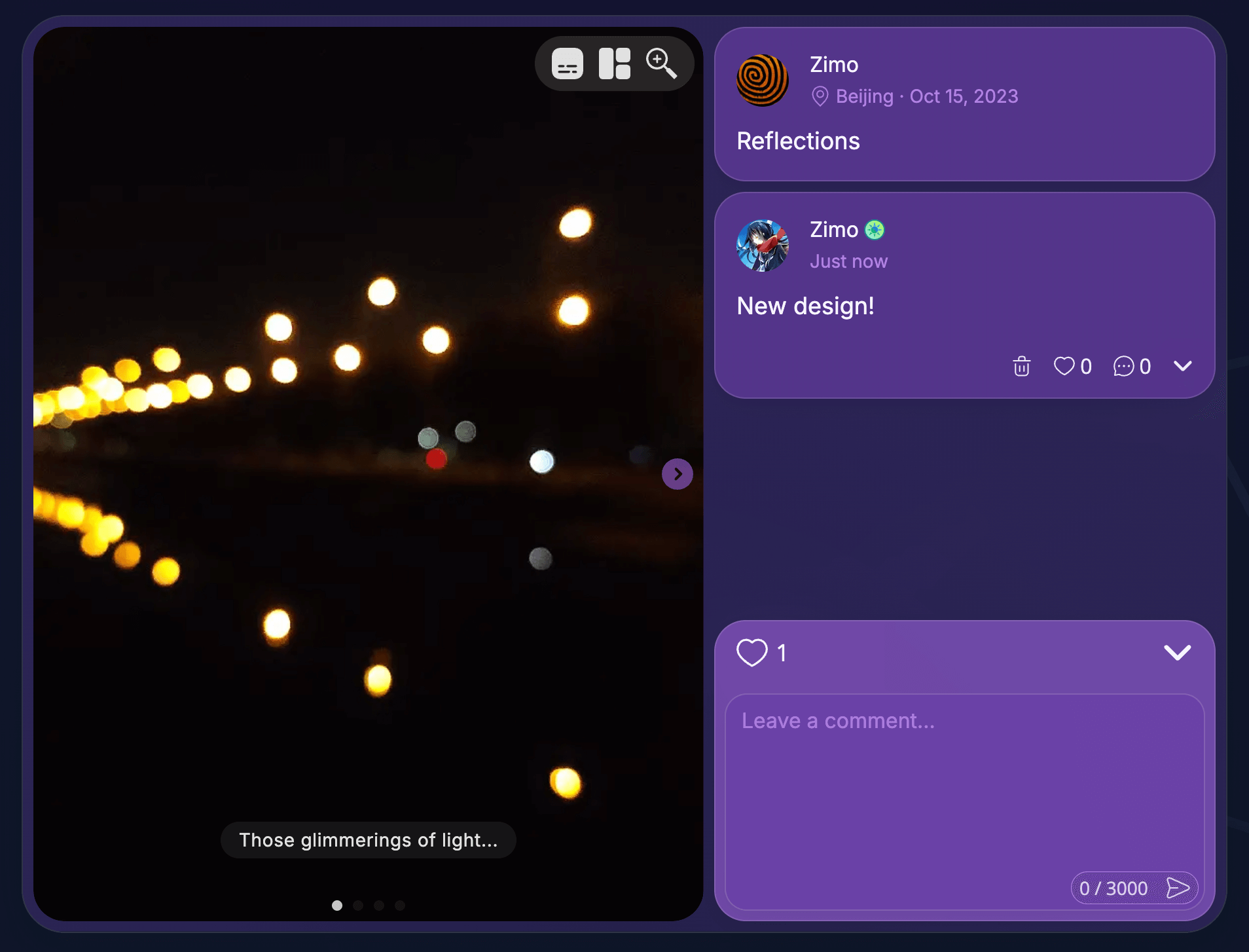
The remodeled album entry layout.
Many layouts have also been reimagined as part of this update. Replacing the more rigid, utilitarian style, elements like album entries are now cleaner and more consistent, with clearer spatial organization. Windows introduced in Update Ouroboros have also received a visual refresh, appearing more refined than ever.
What’s to Come
Update Solarium marks the first step in a long-term rewrite of the project. While this release focuses on visual presentation, an internal rewrite will follow, bringing deeper changes to nearly every layout on the site along with an overhauled theme engine. With the redesign complete, work on reducing technical debt can continue without interruption.