


A Landmark of Design
Zimo
3 min read · 1 day ago
Tags of this article:
Now that the design language introduced in Update Solarium has matured and settled into place, it feels like the right moment to document the elements of this site as a landmark of my design. An informal portfolio, if you will.
All images are screenshots taken directly from the website.
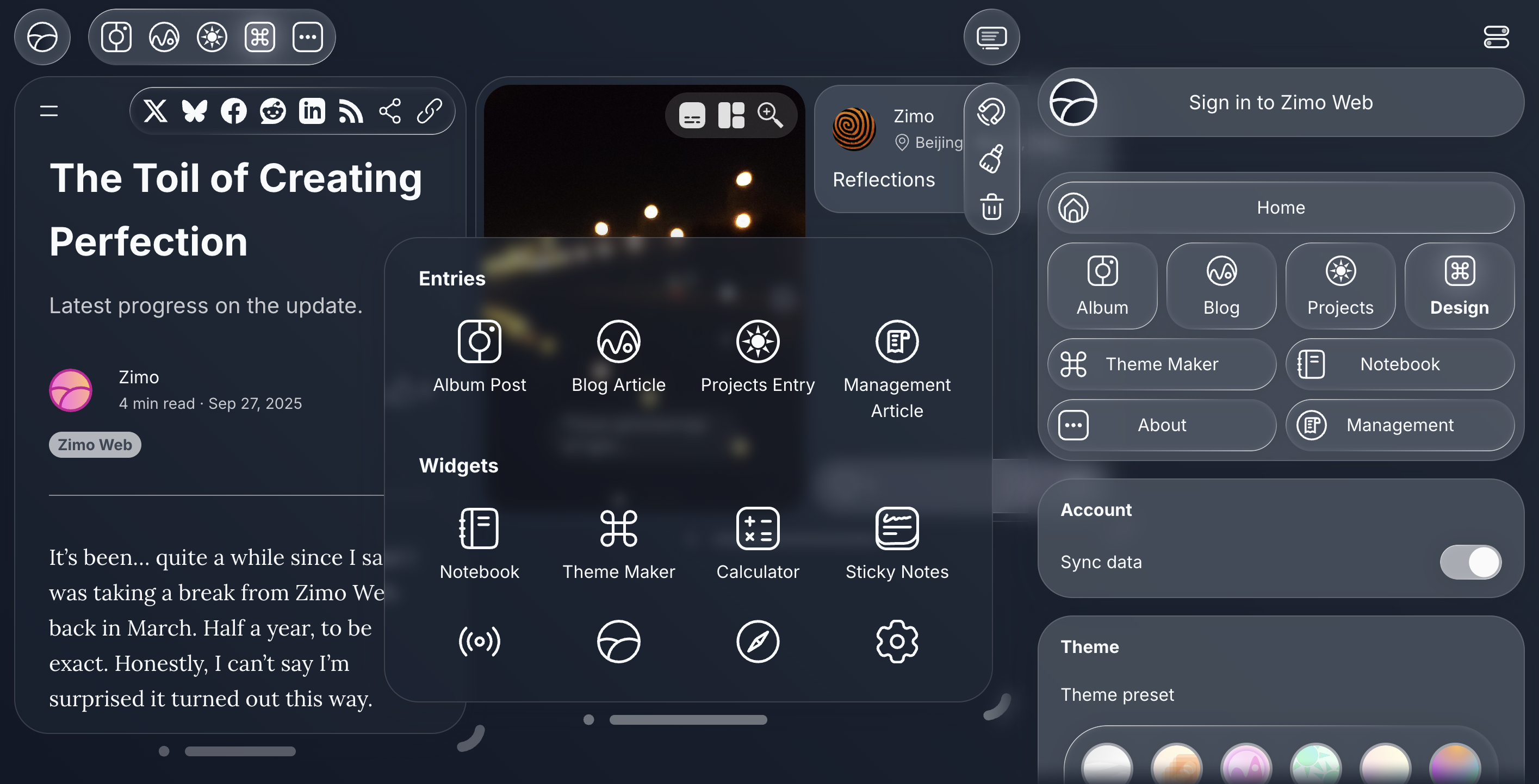
The blog page in the dark mode theme. Dark mode themes were designed to respect each page’s original color palette while improving clarity and readability. It uses an algorithm to adapt the Penumbra theme across different hues. In a way this addition leans toward a more traditional web theming approach, in contrast to the site’s otherwise more expressive aesthetic.
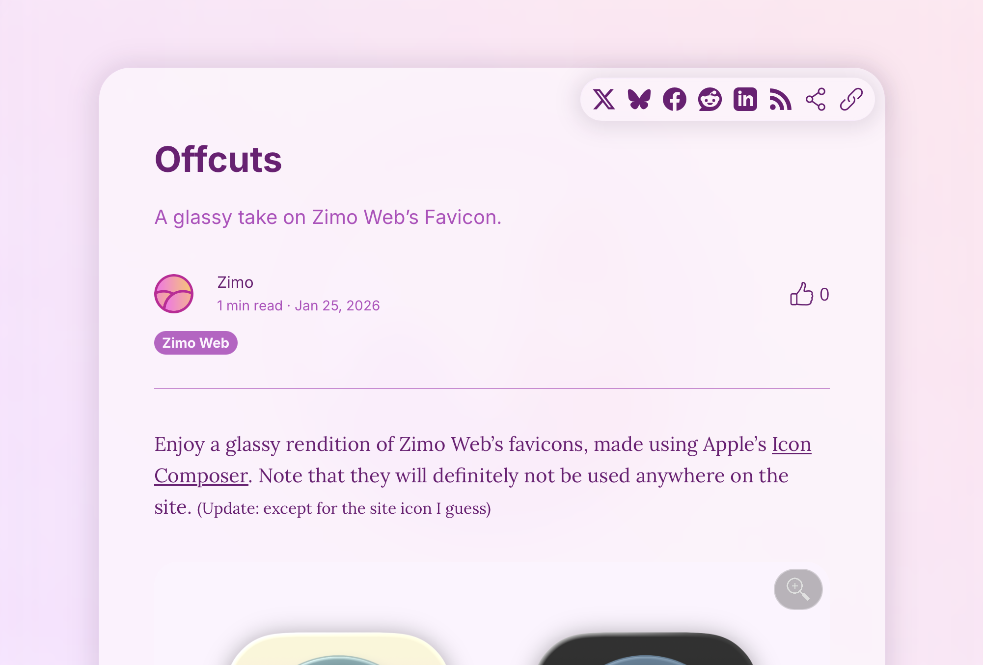
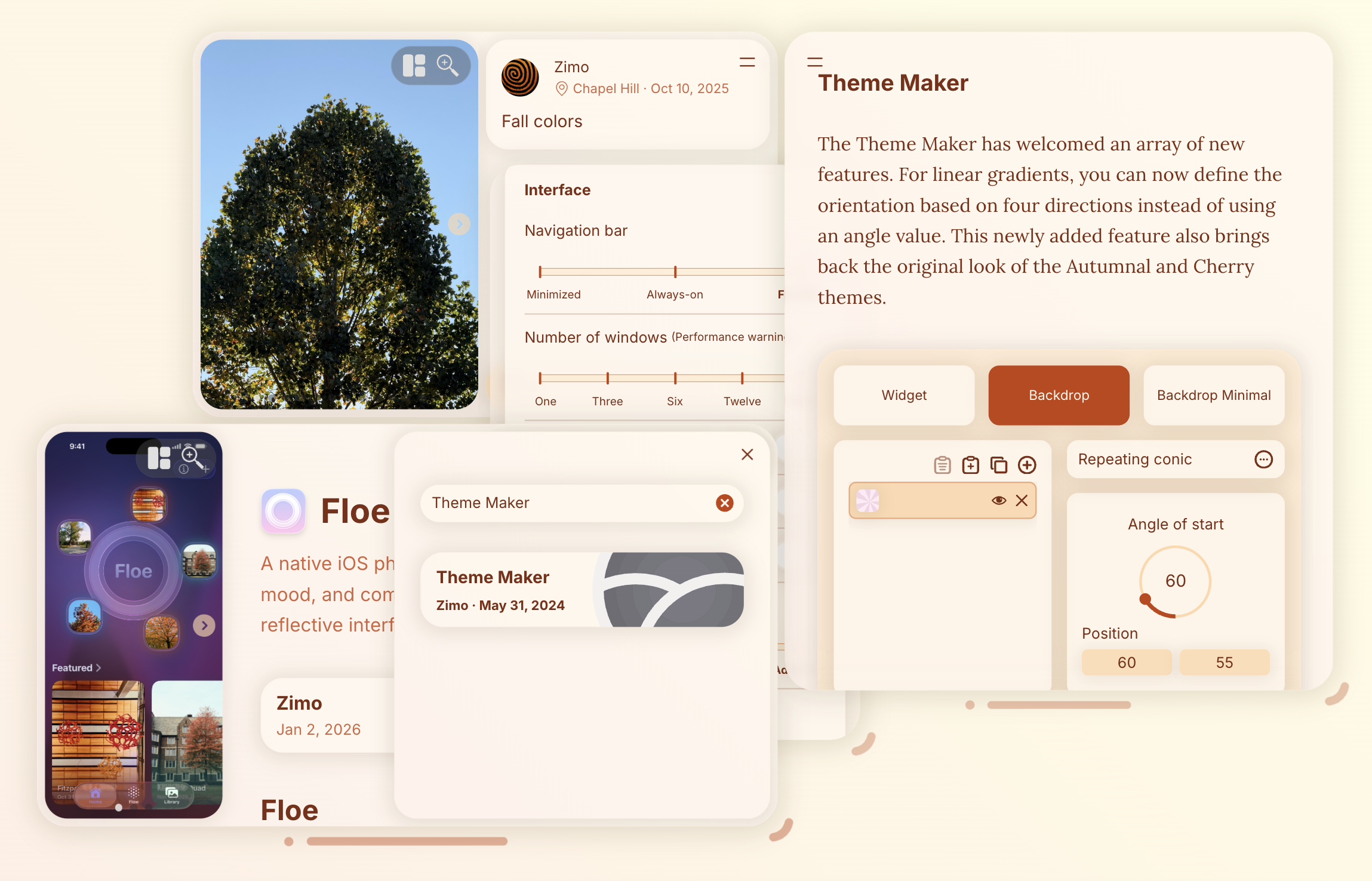
The Perpetuity theme adapts the site’s original favicon with a near-white outline. Paired with the new specular-highlighted container and the theme’s distinctive magenta background, it presents the site’s ubiquitous icon with clean focus.
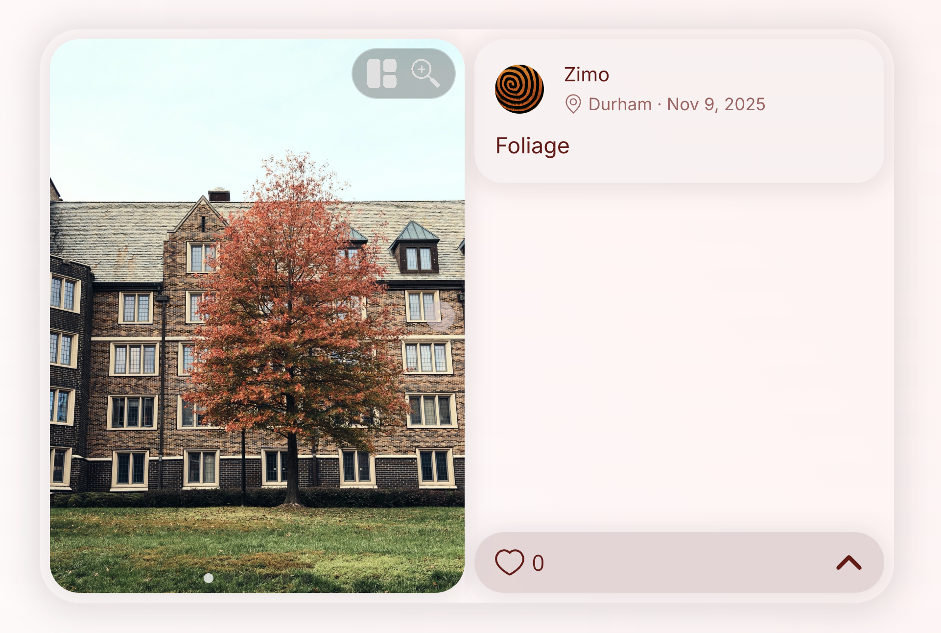
The album entry layout was redesigned as part of the update. It adopts a more modern, card-based structure paired with a subtle, glass-inspired aesthetic, along with consistent corner radii and a more deliberate use of shadows.
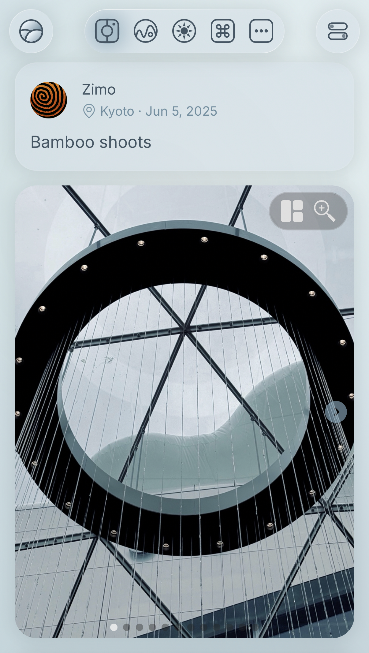
I took the chance to redesign the album entry’s mobile view. With the navigation bar blending into the main layout, the layout is strengthened by the card-based structure to create a more unified aesthetic.
Very little has changed on the blog entry page since the site first went live. The original theme still holds up, and the soft gradient and clear contrast pair with it exceptionally well.
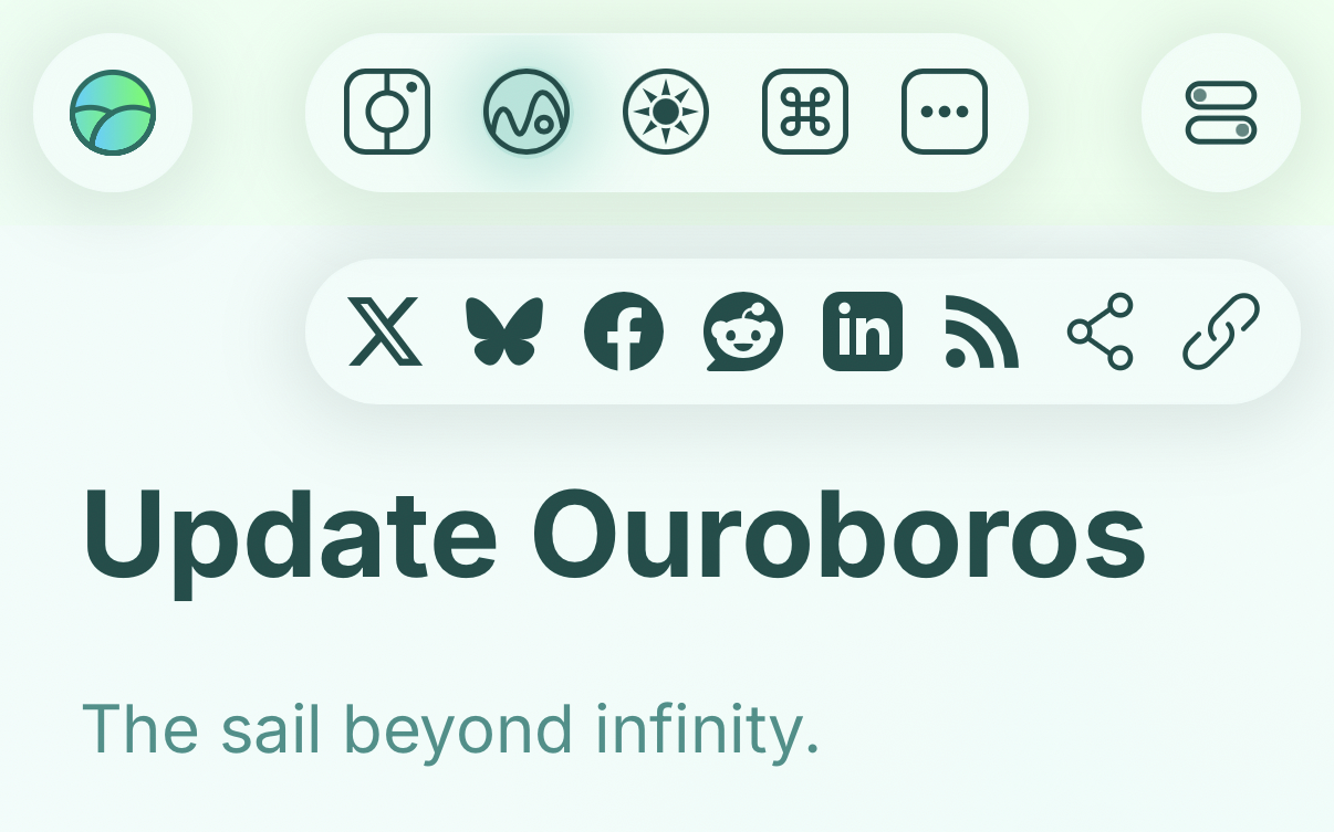
I brought a slight hint of the card-based layout to the social media buttons on the blog entry page. Especially on mobile, they sit comfortably alongside the updated navigation bar and feel more cohesive within the layout.
As with the album entry, the projects entry layout was refined to align with the new design language, albeit more subtly, surprisingly natural.
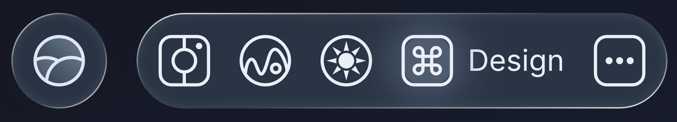
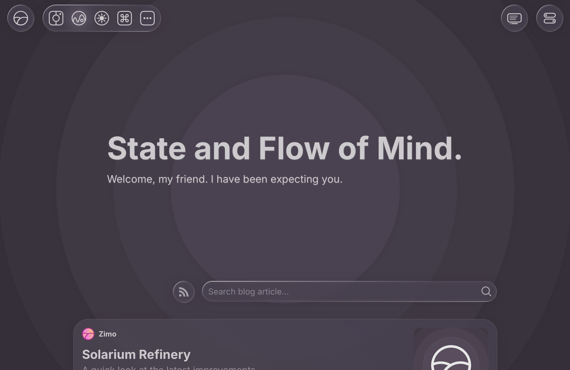
The navigation bar was among the first elements conceived in the new design. Rather than spanning the entire horizontal space, it’s divided into functional groups with clearer roles. Paired with the specular highlight, it stands out as one of the most prominent and defining elements of the design system.
The window button was moved into the navigation bar instead of sitting abruptly at the bottom. Along with the utility buttons, it now feels more cohesive and functionally integrated.
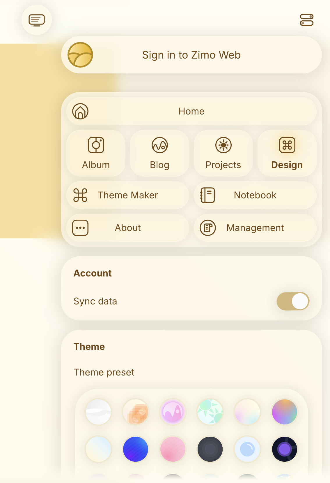
The side menu was one of the more difficult elements to fit into the system. It now fades in with a subtle scroll-edge effect, floating above the main content without a defined border.
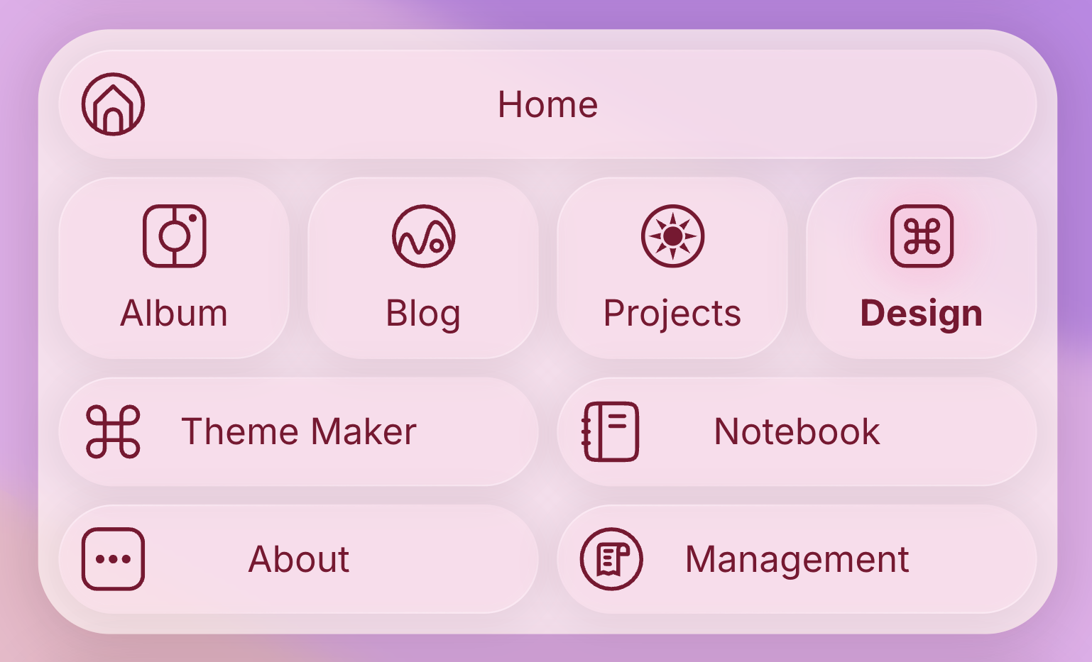
The navigation menu was made more compact, with the layout subtly indicating the hierarchy of pages. A slight tint reinforces the glass aesthetic and helps it stand out without adding visual weight.
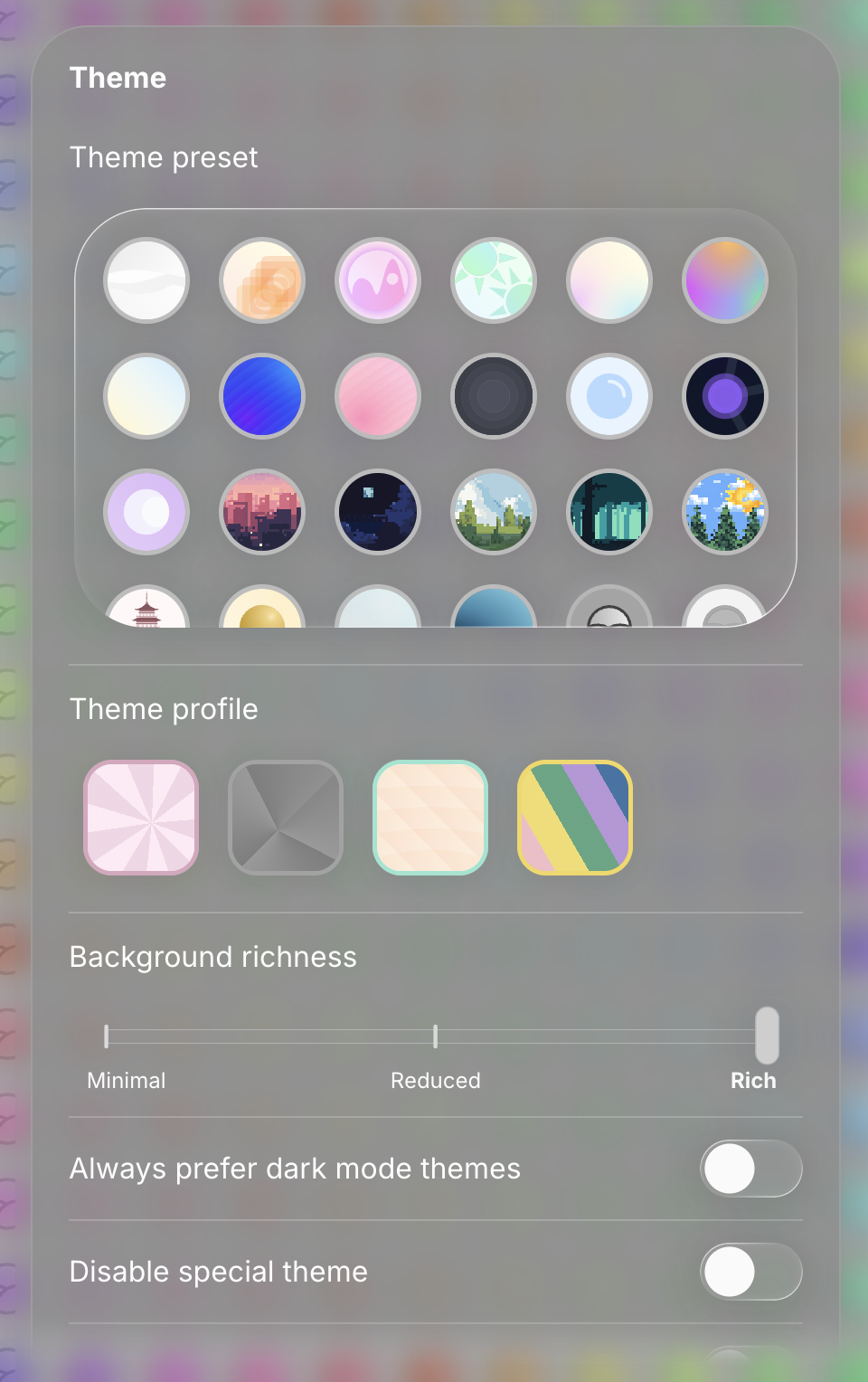
Themes have always been the defining feature of Zimo Web’s design. As the design system evolved, I took care ensure it accommodates a wide range of themes, working with variations rather than conflicting with them.
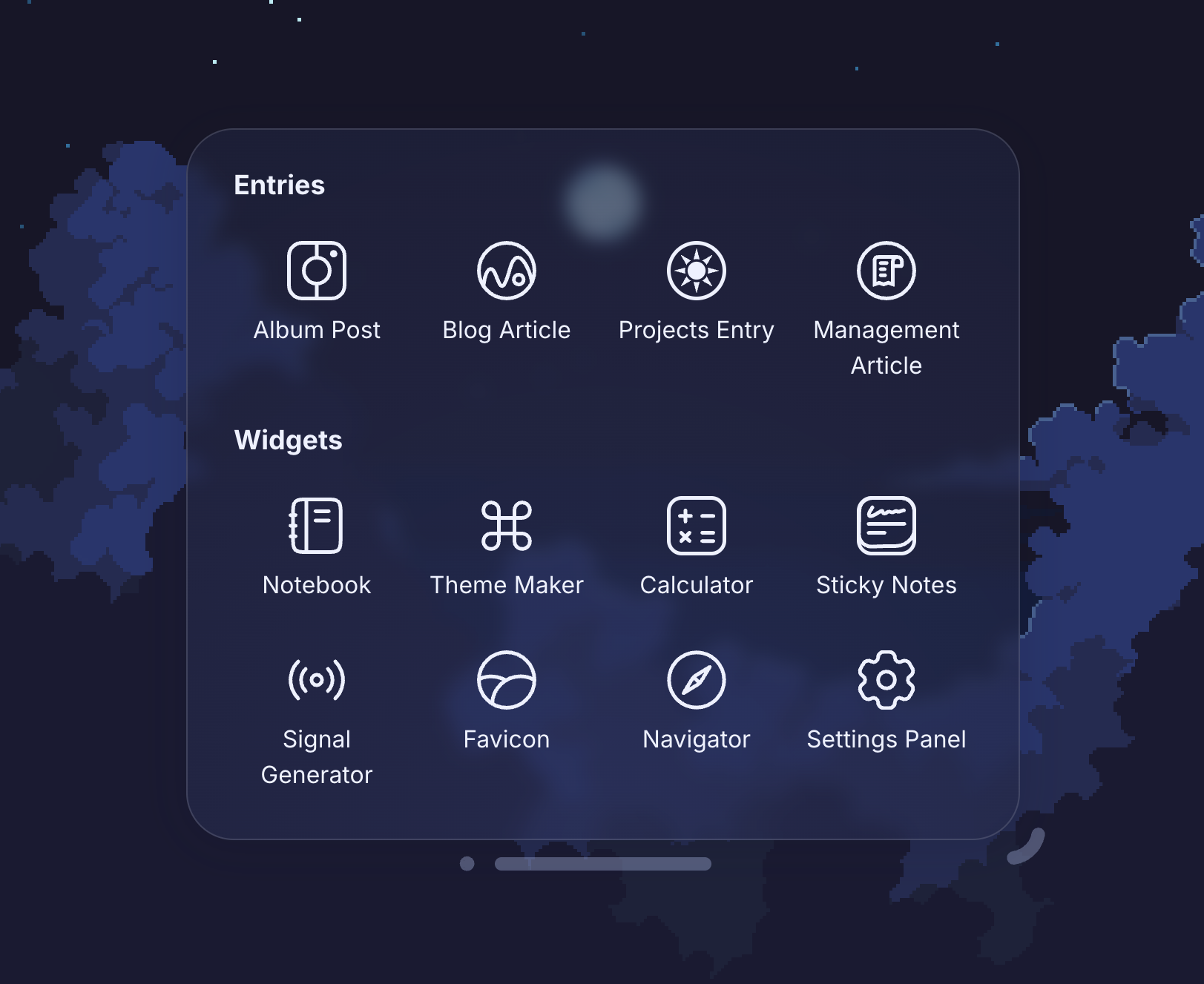
The window engine was an addition to an otherwise traditional browsing paradigm. While it’s versatile, it’s designed to augment the core experience rather than replace it, focusing on utilities and widgets rather than primary content.
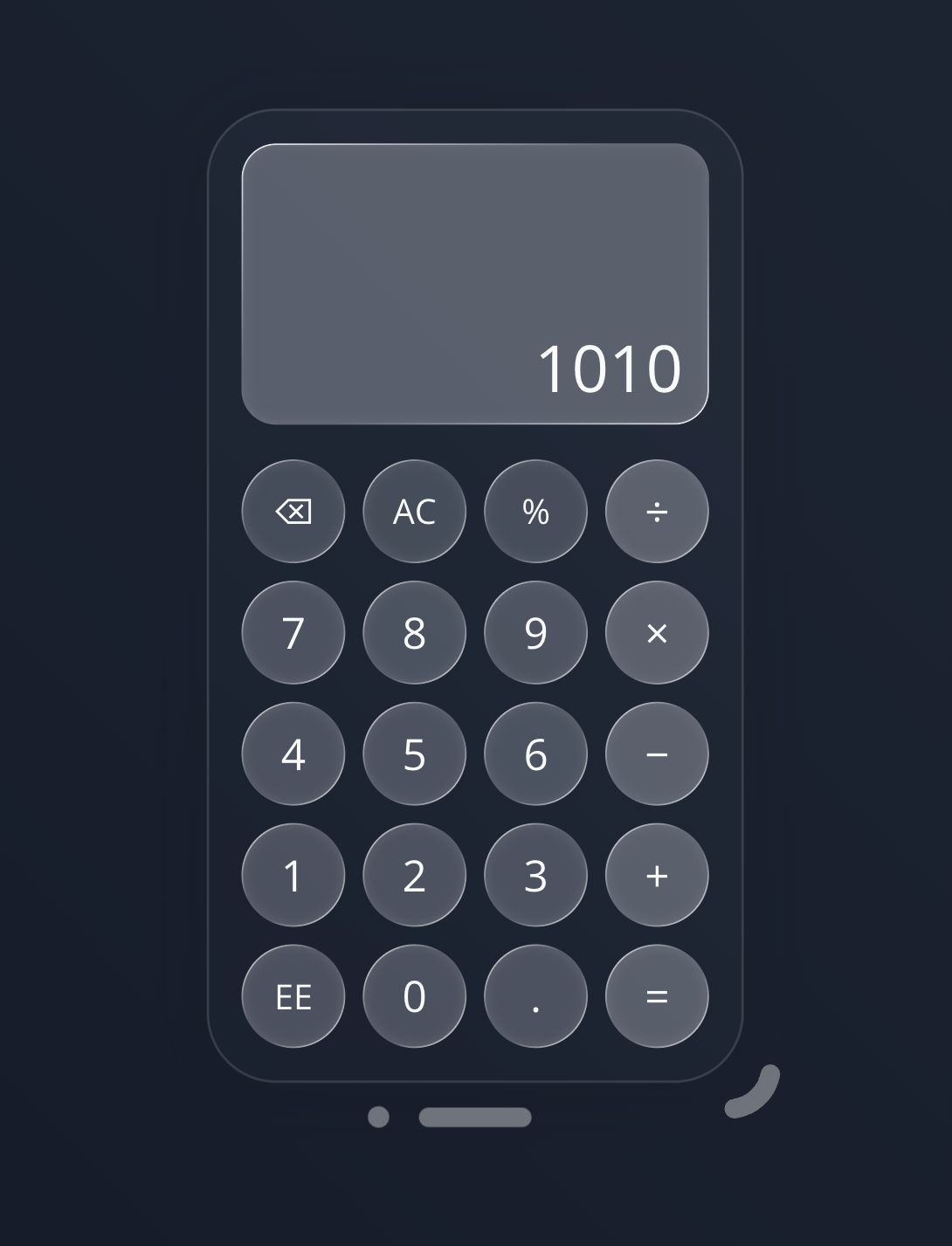
The calculator saw perhaps the most noticeable refinement from the specular highlighting. With minimal changes, the buttons feel more pronounced and visually cohesive within the overall system.
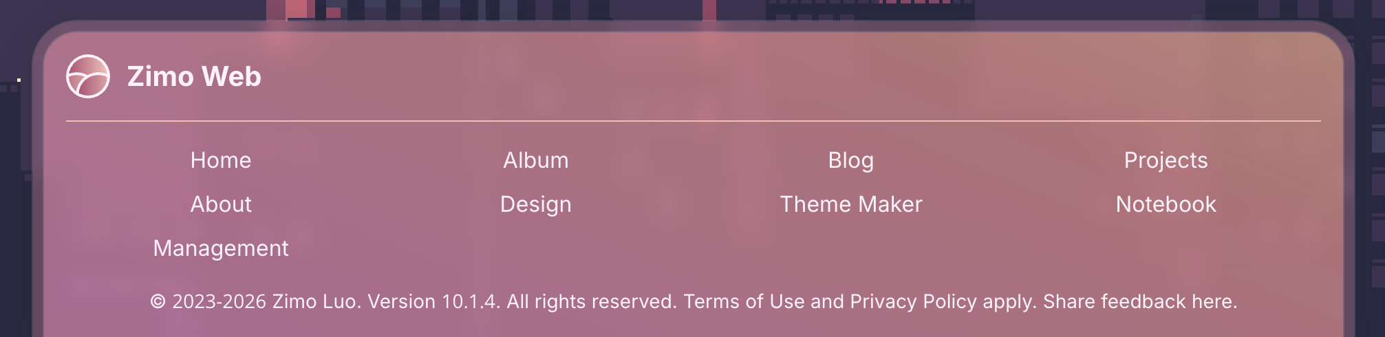
The footer adopts the card-based design in its own way. It uses a two-layer structure, pairing a more translucent glass layer with more defined content layer, allowing it to integrate with the system while maintaining a distinct identity.
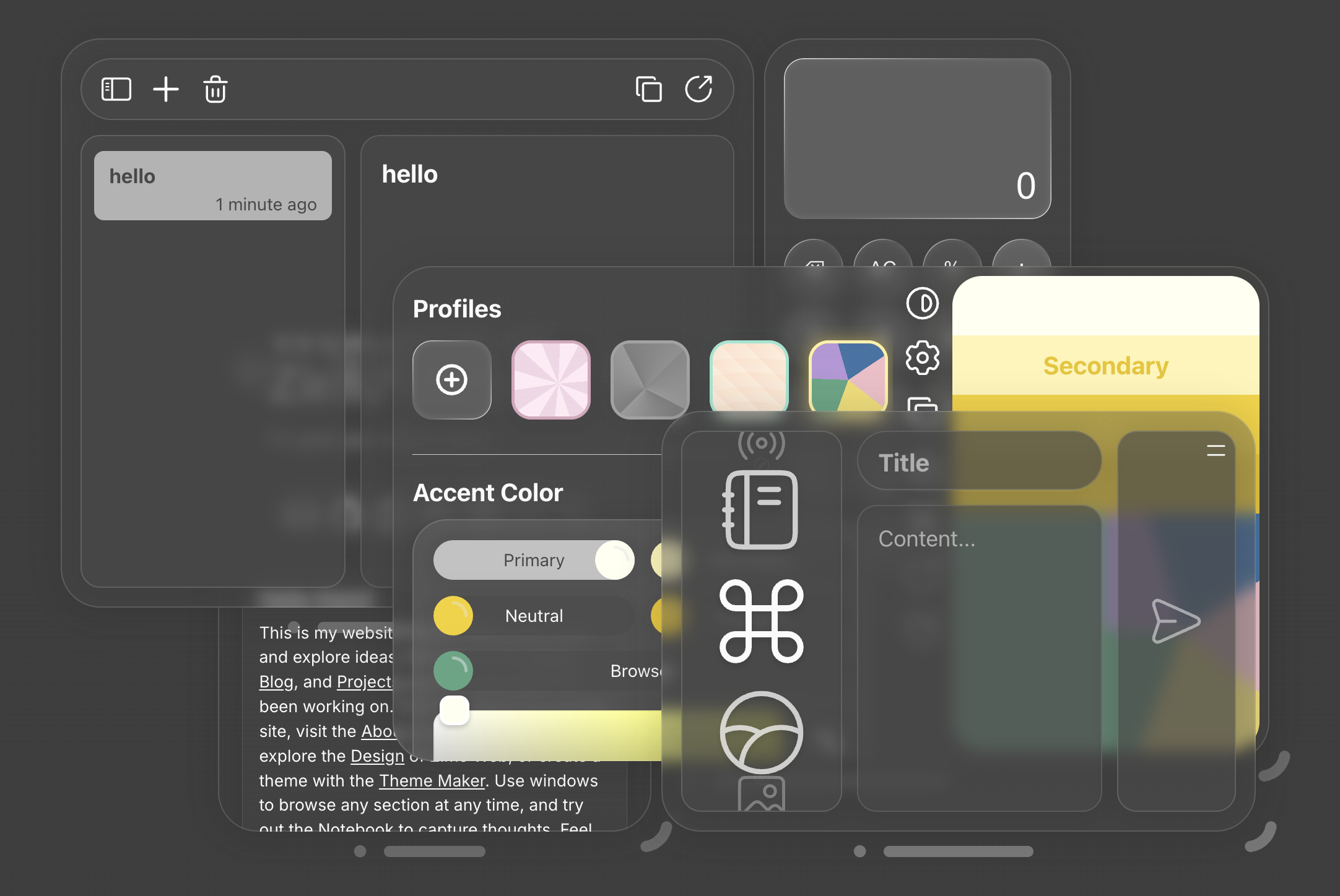
Windows aligning in harmony, as intended to be. Arranging different types of windows into a grid-like layout, while finding a theme that best enhances the presentation. A consistently pleasant experience.